
The Witcher series has held a special place in my heart ever since I played the first game. I remember running it on the lowest settings with Czech dubbing — and even then, it was an experience like no other. I vividly recall fighting Echinops in Odo's garden and facing Alghouls in the cemeteries of Vizima. The Czech voice actor truly nailed Geralt’s character and served as my guide into the dark, immersive world of the Witcher.
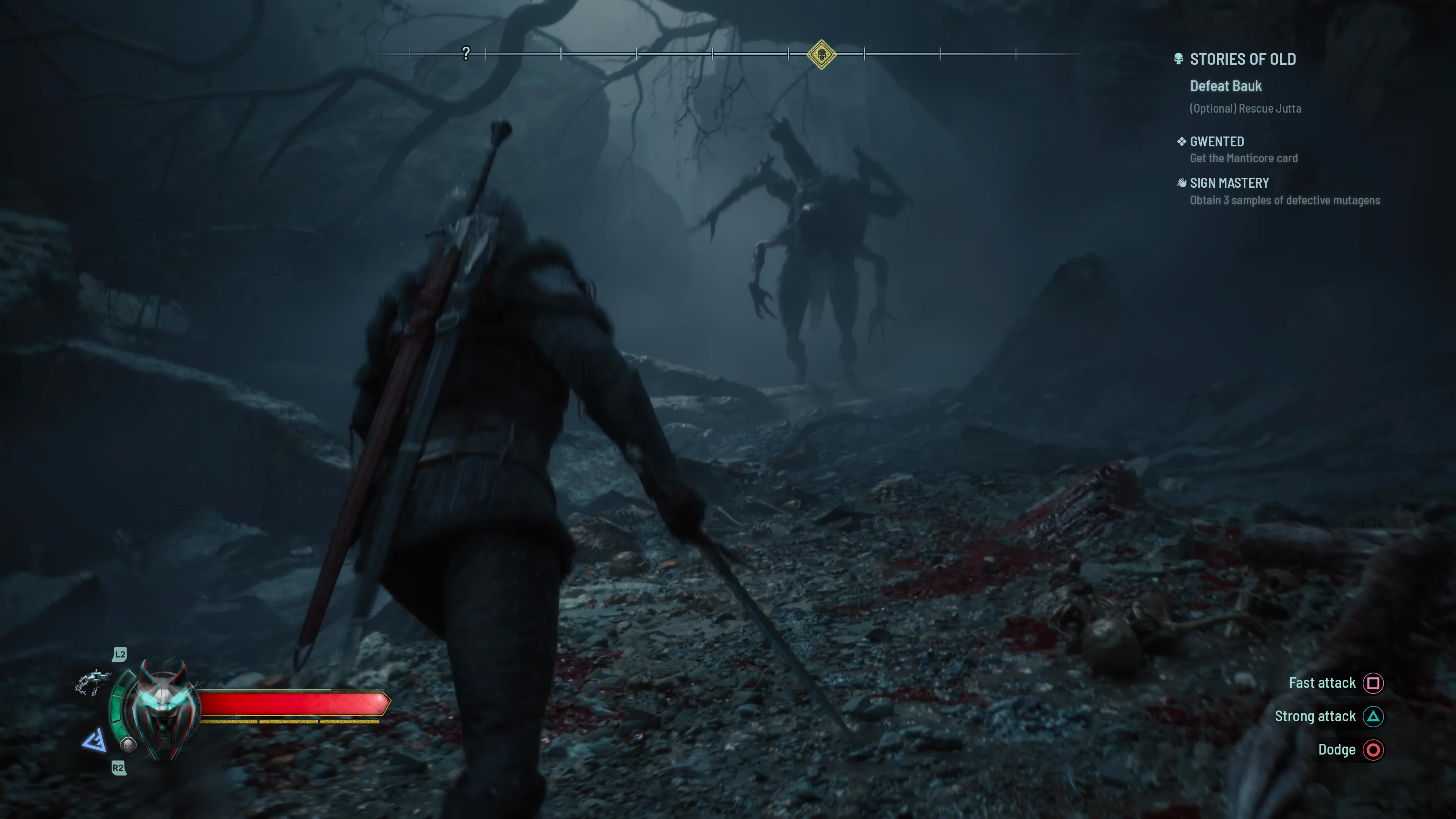
Fast forward to today — I just watched the cinematic trailer for the upcoming Witcher game, and that same feeling came rushing back, only deeper and more layered after years spent with Geralt, both in the books and the games. One moment stood out to me in particular: the camera angle behind Ciri as she charges a monster. It looked like a perfect shot pulled straight from gameplay — and that’s when I knew.
I want to build video games.
It’s something I’ve always dreamed of, but now, after years of experience in UI/UX design, I finally have the confidence to pursue it.
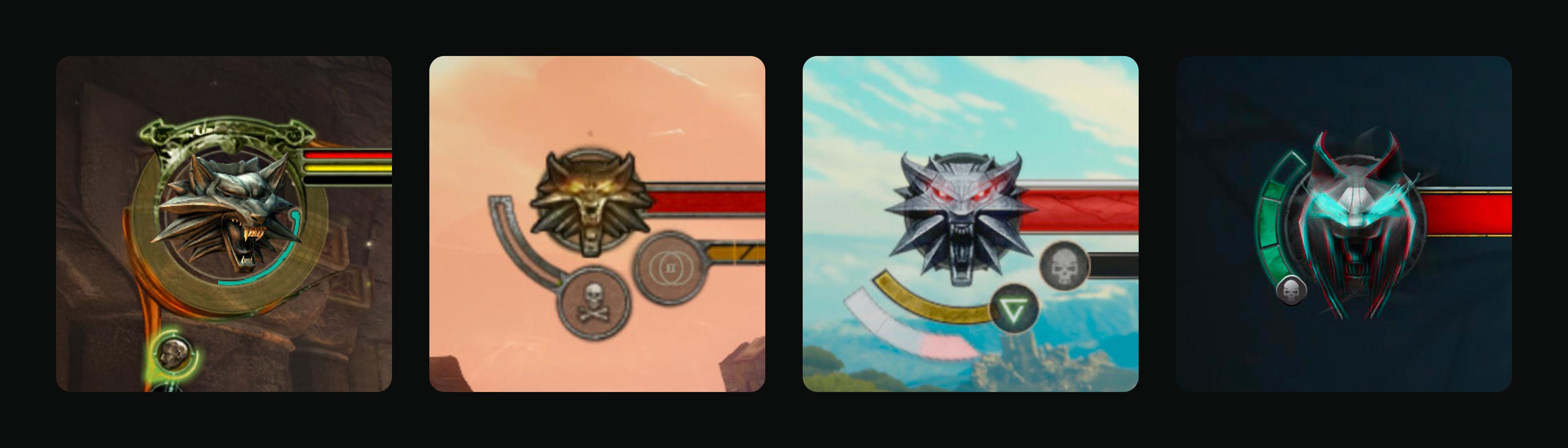
I designed the HUD for the upcoming title, drawing inspiration from the previous games in the trilogy. Each entry follows similar UI patterns, and I believe preserving familiar elements is essential for consistency and a smooth player experience.
One notable evolution is the shift in color palette — from earthy browns to a pale blue. This subtle change opens up exciting creative opportunities to enhance the game’s atmosphere while also establishing a clear visual distinction from the Geralt-era titles.
I explored two different directions – traditional and minimal. While both have their merits, I believe the traditional approach aligns better with the game in terms of story, visuals, and gameplay. Both approaches are visualised bellow.
The HUD layout is divided into five main sections:
The placement of the medallion and health bar in the top-left corner is a longstanding design choice in Witcher games, and I chose to preserve that tradition. While I considered relocating it to the bottom left — a common placement in games like God of War or many isometric RPGs — I ultimately decided that maintaining the familiar positioning was more important for returning players.
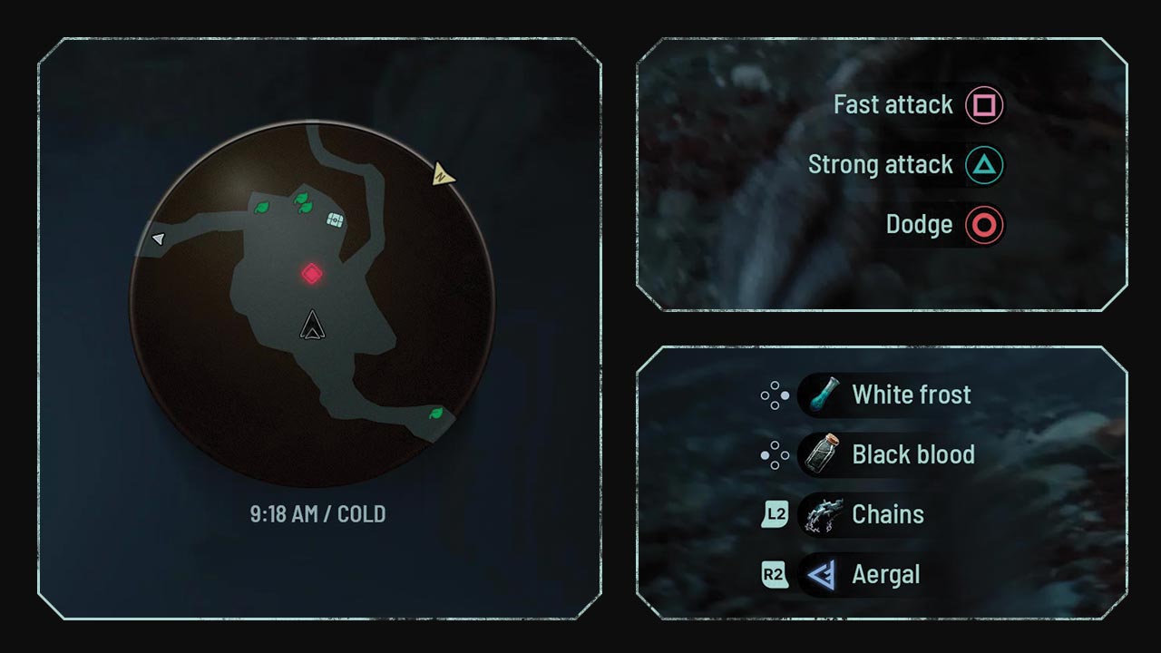
The map is an essential tool for exploration, but it can sometimes make the experience feel too guided. If I had the opportunity to work on the UI, I’d explore solutions where I can transform the map to something more minimalist — for example, offering players the option to toggle certain markers or even play with a reduced or no HUD. The goal would be to encourage a more organic sense of discovery, similar to what Elden Ring offers. Naturally, this would need to be supported on the gameplay side to work effectively.
The items displayed in the bottom left corner follow a layout similar to The Witcher 3, maintaining a sense of continuity. However, I added gamepad input indicators to support players — particularly returning fans who may be playing mainly for the story and taking longer breaks between sessions.
I’ve also made a key change to the item selection: replacing the crossbow from the third game with the chains shown in the trailer. I’m hoping this indicates a new weapon type that Ciri can use, potentially alongside signs.
 Minimal
 Traditional
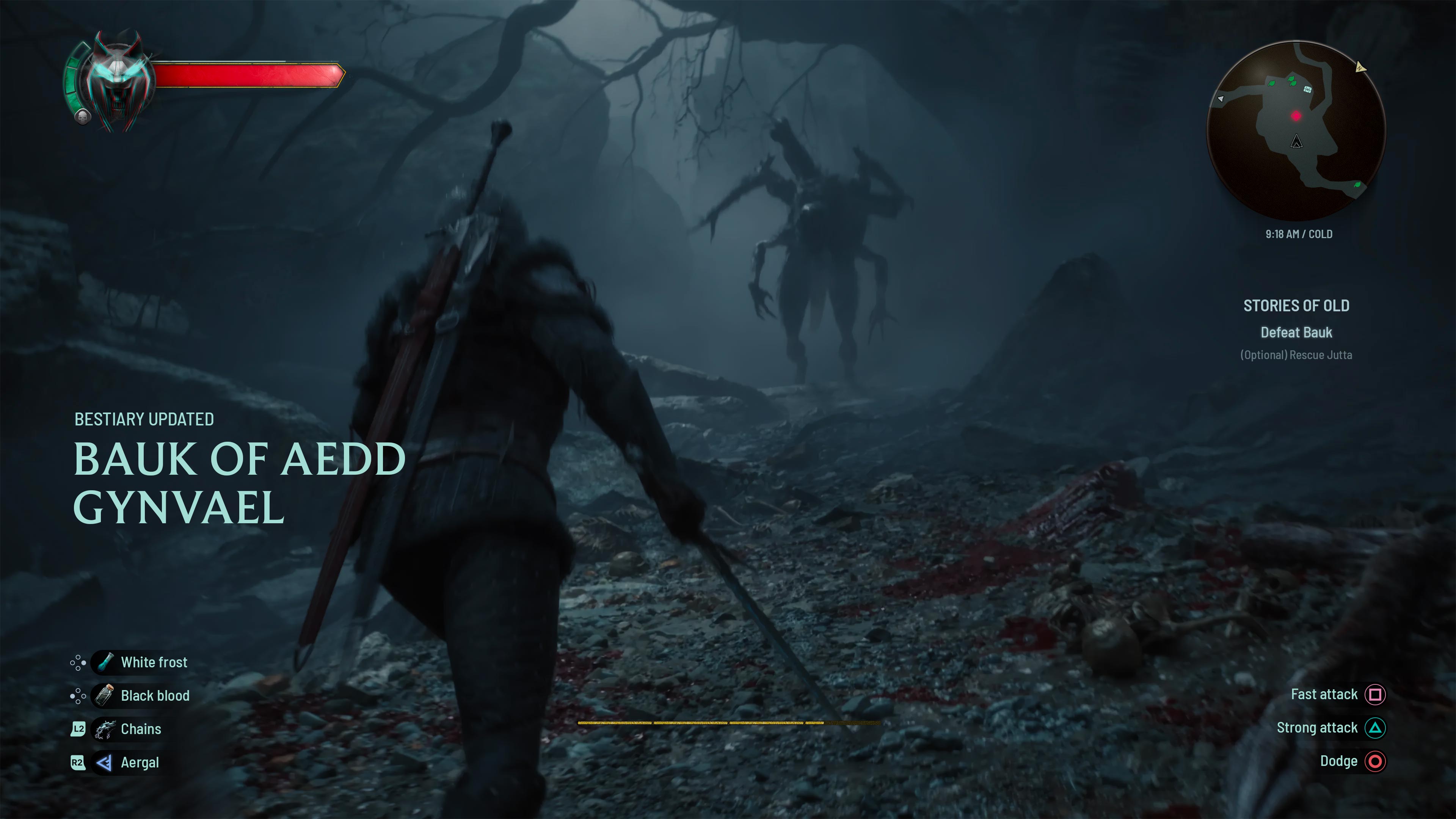
The controls shown in the bottom right corner adapt based on the player’s environment. In combat, players see available combat actions, while in non-combat areas — such as cities — these are replaced with contextual interactions. This dynamic approach helps streamline the interface and keeps players focused on relevant actions.
The final area I focused on is the bottom center of the screen, where I brought stamina and status effects into clearer view. In The Witcher 3, stamina was placed near the medallion in the top left — a clean solution, but one that often required players to glance away from the action to check if signs were ready.
With the new placement, usability improves: stamina is now always within peripheral vision, helping players stay immersed. The bar is segmented into four parts, following the system from the previous game. Just above it, status effects such as frost, fire, or poison are displayed — prominent enough to be noticed, but carefully positioned to avoid obstructing combat.
Beyond static UI, I wanted to explore interactive elements — specifically tackling a challenging use case: swapping abilities mid-combat. This is a high-pressure scenario where intuitive design and quick responsiveness are essential for a smooth player experience.
Most games rely on a radial menu for this purpose, dividing actions into 4–8 segments for quick access. The Witcher 3 also uses an 8-segment radial menu, starting with a sign at the top and spacing the rest evenly around the circle. This approach is player-friendly, as it makes each selection feel predictable and easy to navigate.
Building on this foundation, I designed a radial menu with a more distinct focus on sign selection. I introduced a new sixth sign, Aergal, which I detail later in the case study. These six signs are grouped primarily in the upper half of the radial menu, making them more immediately accessible and visually emphasized.
When the radial menu is triggered, gameplay slows down and the screen transitions into a blurred, grainy, and darker state. This effect helps create a clear contrast between the game world and the UI.
For the next part of the project, I chose to focus on the talent tree, as it brings together a wide range of key UI elements commonly found in in-game overlays – tooltips, interactive elements, controlls & tabs.
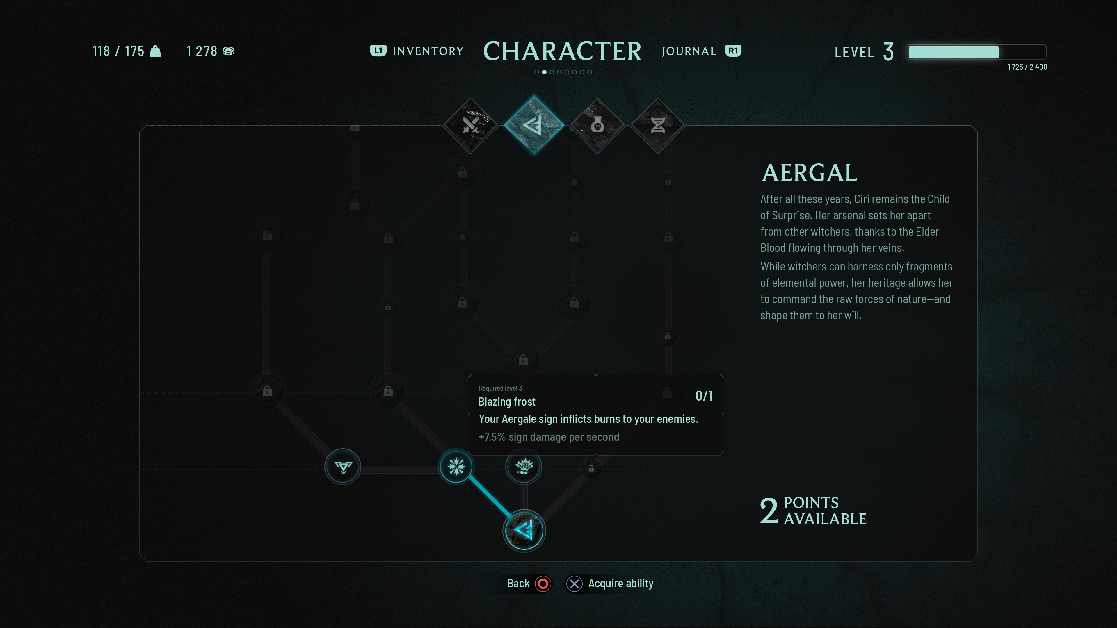
The layout of the talent tree takes inspiration from both The Witcher 3 and Cyberpunk 2077. Cyberpunk uses a tab-based system — accessible, easy to navigate, and well-suited to its near-future aesthetic. The Witcher 3, on the other hand, used a central headline with subtle navigation cues on either side, guiding players through tabs one at a time. I opted for a hybrid approach: combining the clarity of tabs with the focus and elegance of The Witcher 3’s more minimal UI. In addition to navigation, the UI also displays core character stats like inventory weight, money, and level.
For this use case the talent tree is divided to 4 categories: swords, signs, alchemy & mutagens.
I grouped all signs into a single area to create a more focused and explorative experience. Unlike previous games where all signs were available from the start, players would now gradually unlock signs through key encounters, leveling up, and meeting specific prerequisites.
This mechanic draws inspiration from The Witcher 3’s gear hunts, where players followed unique quest lines tied to different Witcher schools. A similar approach could be used here — quests tied to magical knowledge, offering players a deeper connection to what it means to become a Witcher.
Ciri’s version of the signs is built around a new one: Aergal. In the trailer, she’s seen combining water and lightning — a cool moment that hints at exciting gameplay potential. I would explore a system where certain high-level talents or abilities remain obscured until discovered, reinforcing the sense of mystery and encouraging exploration within the UI itself.
If you've come up to this point, I thank you for your attention. Feel free to reach out to me at hello@petrkriz.com – I’d love to hear from you! You can also check my portfolio.